Portfolio

Selected work.

Three client partnerships — a survey firm's website, a brand system and website, and a resort website — each built through the Framework Method.

Featured case study Geomatics engineering — British Columbia & the Canadian North

Aurora Surveys

A website that shows the survey work instead of describing it.

Aurora Surveys provides geomatics engineering and reality capture for transportation, hydroelectric, mining, and energy projects — from downtown Vancouver to Baffin Island.

Aurora supplied their own logo and identity. We designed and built the website around it: a 3D total station walks through a field setup, a traverse map plots each project by latitude, and an animated point cloud shows how ten million raw returns become a usable deliverable.
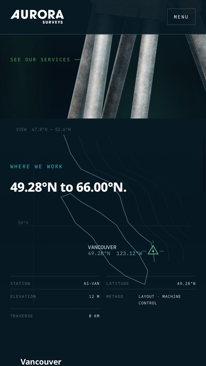
Aurora Surveys website on a phone: the Where we work map, 49.28°N to 66.00°N, starting at Vancouver

The Aurora Surveys website on desktop and mobile — designed and built by Framework

Website palette

  • Night#071A24
  • Navy#0F2D3D
  • Cyan#1DACB5
  • Green#39B44A
  • Ice#EDF2F3

Delivered

  • Website design & build
  • Five-page website
  • Animated aurora hero
  • Interactive 3D total station
  • Project traverse map, 49°N to 66°N
  • Point-cloud process explainer
  • Project records & safety page
  • Enquiry form

Typography

Display
Noto Sans
Body
Noto Serif
Labels
Noto Sans Mono

Voice

Field-precise and plain. Real jobs, real latitudes.

Client testimonial

“I'm happy with the way that Framework utilized geographic design elements and animations that drew the eye, but didn't capture attention at the expense of the information being presented. Their team incorporated our graphic designer's notes, palettes, and overall design approach to our brand and dove into our vibe. Very happy with the aesthetic and navigability of both versions of the website.”

Aurora SurveysGeomatics engineering — British Columbia & the Canadian North

Framework client — Website design & build
Case study Professional Services — Canadian project delivery

Red E Corp.

A brand built on day one for a company built to expand — and the website that puts it to work.

Red E Corp. delivers consulting, project management, and project planning for industrial, commercial, and institutional clients. Its founder came up as a carpenter, ironworker, and millwright before running projects from the office.

We started with strategy: who Red E serves, what sets it apart, and the promise behind the name — Red E 4 Anything. The crest, colour, type, voice, and application rules all follow from that, documented in a single brand system.

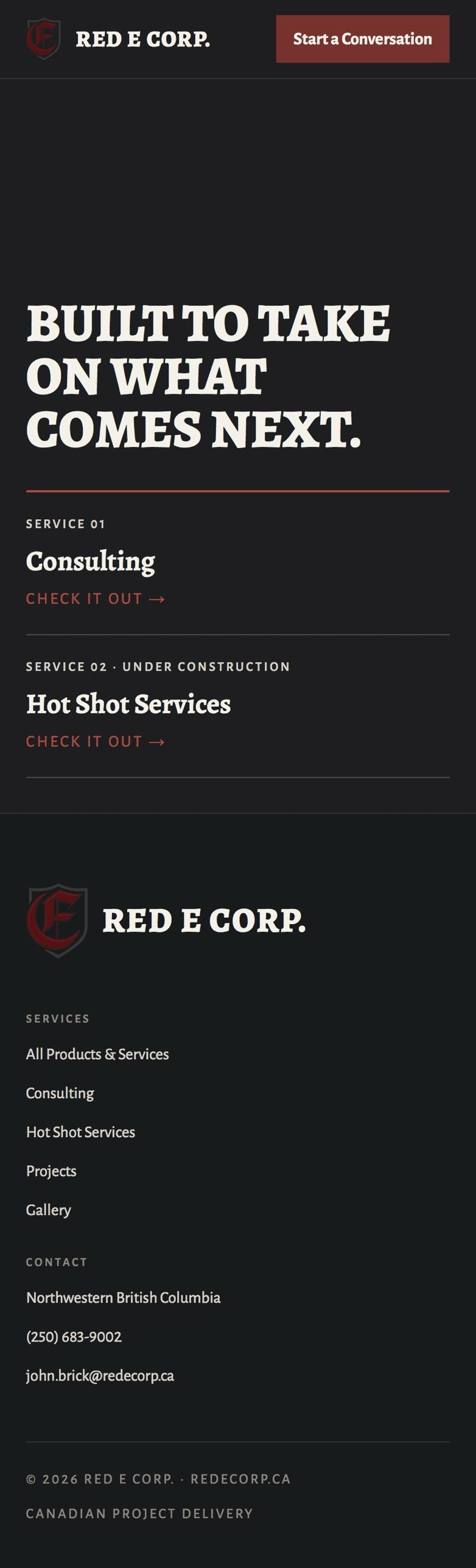
We then designed and built the website from scratch: a full-screen crest landing page, service pages, projects, a gallery, and a simple way to start a conversation. The client supplied the photography; we edited every image to suit the brand.

Red E Corp. website on a phone: the headline Built to take on what comes next, the Consulting and Hot Shot Services links, and the footer with contact details

The Red E Corp. website on desktop and mobile — designed and built by Framework

Colour system

  • Oxide Red#8A2E2A
  • Ink Charcoal#17181A
  • Bone#F5F1EA
  • Steel#4C5257
  • Aged Walnut#8A6B48

Delivered

  • Brand strategy & positioning
  • Crest & logo system
  • Colour & typography system
  • Voice & messaging
  • Brand applications
  • AI brand prompts
  • Custom-designed & built website
  • Service, projects & gallery pages
  • Photo editing & art direction
  • Enquiry form

Typography

Display
Barlow Semi Condensed
Body
Inter
Labels
IBM Plex Mono

Voice

Direct, plainspoken, field-tested. Lead with what's been done, not what's promised.

Framework client — Brand System v1.0, July 2026 · Website live

Visit redecorp.ca (opens in a new tab)
Case study Hospitality — Anahim Lake, British Columbia

Eagle's Nest Resort

A complete website — and the photography on it — for a ten-acre lakeside resort in the West Chilcotin.

Eagle's Nest sits on Anahim Lake, one kilometre off Highway 20 — suites, rooms, and log cabins, run by the owners, Diane and Murray.

We built the site around the questions guests actually ask: where it is, how to get there, and which room fits. Every suite and cabin has its own page, and booking is one tap away on every screen.

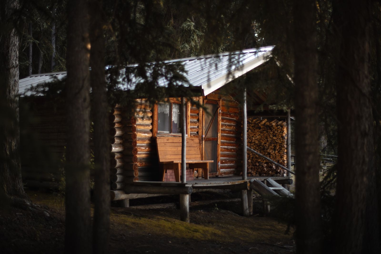
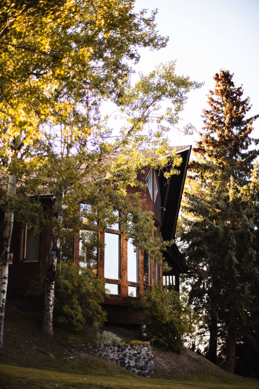
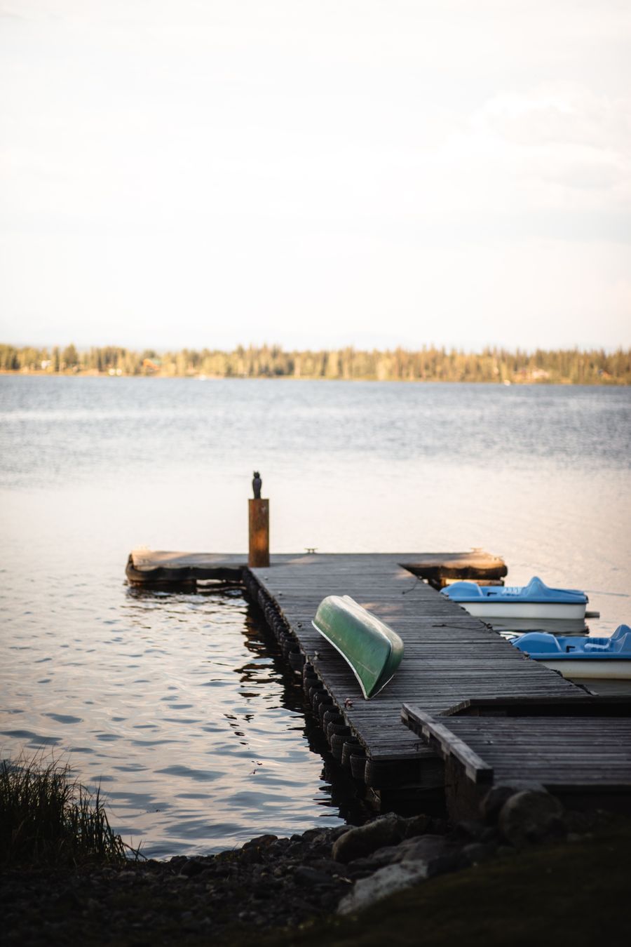
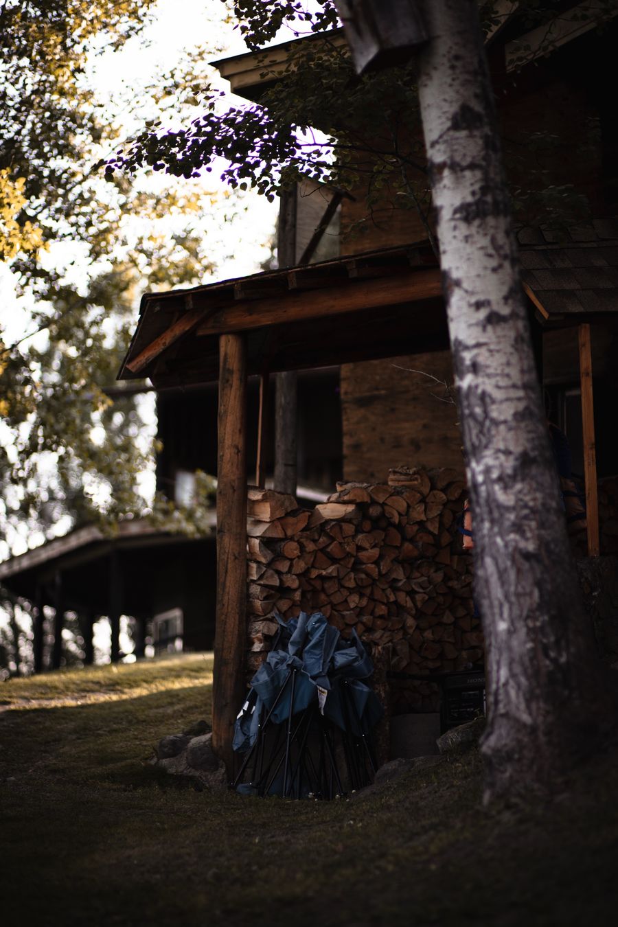
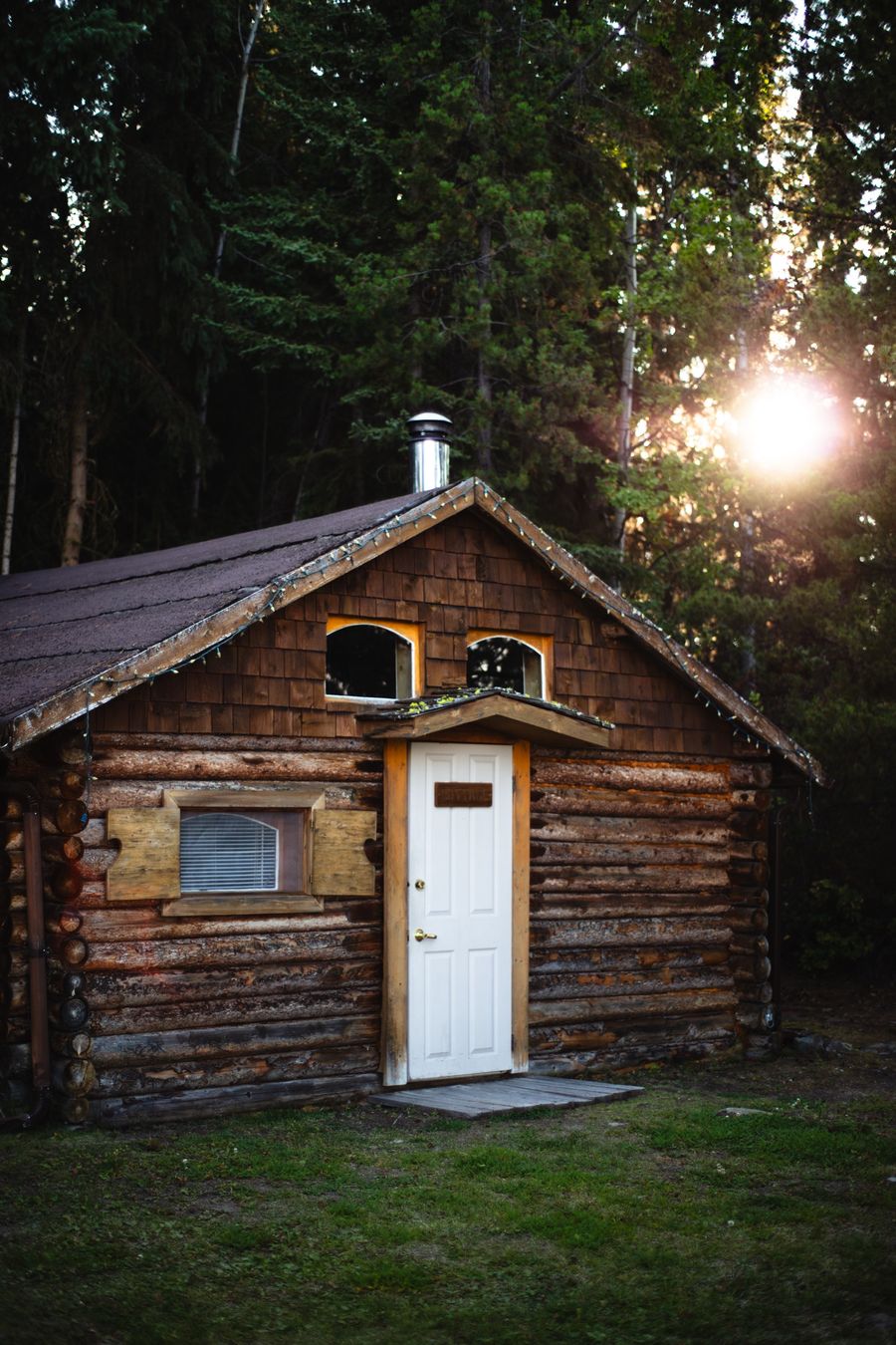
We also photographed the property on site — the lodge, the cabins, and the waterfront — so every image on the site shows the real place.

Colour system

  • Cream#F3EEE1
  • Forest#1F3327
  • Forest Mid#2F4A38
  • Gold#C08E2E
  • Muted Sage#5F6A5C

Delivered

  • Site architecture & copywriting
  • Home page with Highway 20 route map
  • Lodge page + 12 accommodation pages
  • Filterable accommodation list
  • On-site photography
  • 34-photo resort gallery
  • Booking page & enquiry form

Typography

Display
Bevan
Labels
Oswald
Body
Lora

Voice

Plain and neighbourly. Straight answers from the people who run the place.

Framework client — Website live

Visit eaglesnestresort.ca (opens in a new tab)
Get started

Want your business here next?

Start your project with Framework. The next case study on this page could be yours.